
Indian Banknote Errors 2/3
Discover rare Indian banknote errors like missing faces, inverted prints, offset ink, and more. Learn what makes these Indian paper money mistakes collectible.

In Indian banknote collecting, production errors offer a fascinating window into the intricate, multi-stage process of currency creation. These anomalies can occur at various phases — from initial design to final printing and cutting — resulting in banknotes that differ in unexpected and collectible ways. Building on insights from Part 1 of our Indian Banknote Errors series, this second installment delves into some of the most visually striking error types, including missing design elements, offset impressions, and inking inconsistencies. From blank faces and backs to misregistered prints, each error reveals the fine margins of precision that define the integrity of currency production.
9. Blank Faces / Backs
Blank front or back errors occur when one side of a banknote remains entirely blank due to a production oversight. In the typical banknote printing process, both sides are printed with intricate designs and security features to ensure functionality, authenticity, and aesthetic appeal. However, with a missing obverse or missing reverse, one of these steps fails, resulting in a note that is blank on one side. This omission leads to a visually striking note with one fully detailed side and another left completely blank, creating a sharp contrast to the intended design.
The occurrence of a missing front or missing back highlights the complexity and precision of the multi-step printing process involved in currency production. Each side of a banknote undergoes separate printing stages, and if one step is skipped or incomplete, it results in this type of error. The missing print draws attention to the layered workflow of banknote production, where each phase—background tints, intricate designs, and security elements—must align perfectly to create a fully realized note. The stark contrast between the fully printed side and the blank side gives the note a unique aesthetic, making it easy to distinguish from other errors that may affect only portions of the design. This absence often amplifies the note's desirability, as it showcases a larger and more noticeable deviation compared to minor misprints or shifts.
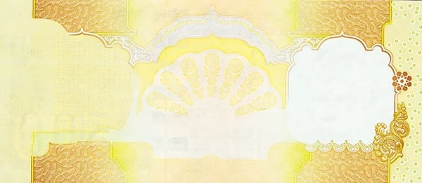
10. Blank Faces and Backs
Blank front and back errors are unique in that both the main front and back designs are absent, leaving only certain overprint elements like serial numbers or signatures visible on a blank canvas. In these cases, the background patterns, colors, and main designs that typically cover each side of the banknote are missing, creating a minimalist and unexpected look. The presence of overprint elements floating on an otherwise blank surface is a striking deviation from the fully printed design and emphasizes the individual layers applied during the production process. Without the detailed underprint and primary design, the remaining overprints stand out in stark contrast, offering a glimpse into the note’s functional features.
This type of error with missing face and blank back provides insight into the segmented workflow of banknote production, where various stages—underprint, primary design, and overprints—are applied in sequence. When the main designs are missing, the remaining overprint elements take on a new prominence, drawing attention to key features that denote a note’s authenticity. It showcases how the overprint stage functions independently from the rest of the design, as these elements are applied after the main artwork. The incomplete look of a note with missing obverse and missing reverse designs reveals how critical each production stage is to the overall appearance and security of a banknote.
11. Identical Faces and Backs
Identical face and back printed on different sides is a unique and visually striking printing error, where the same side of a banknote’s design appears on both the front and back, resulting in an identical face-to-face or identical back-to-back note. Instead of featuring distinct designs for each side, the banknote ends up with identical obverse or identical reverse, such as two fronts or two backs. This duplication usually occurs due to a misalignment or loading error in the printing setup, causing the same design plate to be used on both sides. The result is a unique, visually distinct banknote that lacks the typical contrast between front and back, with the same imagery mirrored on either side.
Such an error underscores the importance of each printing stage in ensuring that both sides of a banknote contain specific, complementary information. Having an identical face or identical back on both sides disrupts the banknote’s structure and functionality, as it lacks the clear informational cues and security features intended to distinguish one side from the other. This identical face-to-face or identical back-to-back arrangement resulting in same face and back affects the intended design flow, as each side is usually crafted to balance informational and aesthetic elements. This error highlights the need for accuracy in maintaining the correct sequence of designs throughout currency production.
12. Inverted Faces / Backs
Inverted face / back refer to a printing error where one side of the banknote, either the obverse (front) or reverse(back), is printed upside down in relation to the other side. This misalignment means that when one side of the note appears correctly oriented, the other side is inverted, creating a noticeable disruption in the note’s layout. Inverted obverse or inverted reverse errors occur due to a misalignment in the printing or cutting process, where one of the design plates is rotated 180 degrees. This results in a banknote with an unconventional look, as the top and bottom of the two sides do not align as intended.
Such an error reveals the precision required in currency production, where each step must be meticulously synchronized. The appearance of inverted faces or inverted backs on a note disrupts the standard orientation and can impact the overall functionality, as banknotes are designed with specific front and back alignments for quick identification and use. In this case, the inverted printing creates a mirror effect that makes it challenging to align the faces and backs as they would appear on a standard note, emphasizing the importance of accuracy in every stage of the printing process.
13. Missing Design Portions
Missing design portions refer to an error in which a significant and essential part of a banknote’s main design is absent. Unlike errors involving missing overprints or underprints, missing design portions affect major elements of the note itself, such as a portrait or facial image, an animal, a building, or the denomination symbol. This absence leaves the affected area blank, disrupting the overall appearance and balance of the note. Missing design portions may occur on either the obverse (front) or reverse (back) side, or even on both sides in rare cases. The result is a visibly incomplete banknote that lacks integral design elements typically meant to communicate cultural, historical, or security information.
This error is also distinct from missing front or back errors, where one entire side remains blank. Instead, missing design portions impact specific areas of the intended artwork, leaving parts of the main imagery unprinted. For example, a banknote missing its central portrait, such as Mahatama Gandhi, or primary national symbol, such as Ashoka Pillar, presents a stark, unbalanced appearance as other elements remain fully printed around the blank area. This type of error highlights a breakdown in one of the printing stages, particularly in the detailed steps where these significant design components are applied.
14. Background Colors Missing
Background colors missing is an error where the banknote’s foundational layer of color is absent from the obverse (front), reverse (back), or occasionally both sides. This background color layer typically serves as a base for the more intricate designs, adding depth and a cohesive visual structure to the banknote. When this layer is missing, the note appears unusually plain or washed out, as other design elements lack the complementary color that normally highlights them. The absence of background colors results in a stark appearance, emphasizing the details of the overlying print while leaving the overall look incomplete.
This error is visually distinct because background colors are essential for creating a uniform appearance and enhancing security features. A banknote missing these colors disrupts the intended design flow, as the primary images, security patterns, and text are typically printed with the background color in mind. Without it, symbols, portraits, and other key design elements may seem to float against a blank surface, giving the note an unfinished look. Missing background colors demonstrate the layered nature of banknote production, where even a small disruption in the base layers can significantly alter the final appearance of the note.
15. Offset Errors
Offset errors, also known as wet ink transfer errors, occur when the ink on a freshly printed sheet has not fully dried, causing it to transfer onto the next sheet in the printing stack. This results in a faint, unintended impression of the front (obverse) or back (reverse) appearing on the opposite side of the banknote. Offset errors give the impression that both sides of the note are partially printed on a single surface. Depending on the extent of the ink transfer, these errors can range from partial offsets, where only portions of the design are visible, to complete offsets like a complete front to back offset or complete back to front offset, where the entire front or back design appears faintly on the opposite side.
The offset printing error differs significantly from errors such as identical faces and backs, which occur due to a misalignment in the printing plates rather than ink transfer. Offset errors create a ghostly or mirrored effect, often with only portions of the design visible due to the incomplete transfer of wet ink. Complete front to back offsets and complete back to front offsets are especially noticeable, as they provide a full, albeit faded, mirror image of the design. These errors illustrate the importance of drying time in the currency production process, where even minor miscalculation in drying time can lead to striking and unexpected visuals on the banknotes.
16. Inking Errors
Inking errors are a fascinating type of banknote printing issue that occurs when there is an irregularity in the amount or type of ink applied during the printing process. Insufficient ink or underinking happens when not enough ink is applied, resulting in faded or incomplete designs that appear lighter than intended. On the other hand, excess inking involves too much ink being applied, causing the design to appear overly bold or blurred, sometimes even obscuring finer details. Ink smears and solvent smears can also occur if the ink spreads unintentionally across the surface due to improper handling or excess solvent, leading to smudged areas that disrupt the banknote's clarity. These errors add unique visual characteristics that break from the crisp, standardized appearance typically expected on banknotes.
Inking errors are distinct from offset errors, which occur due to wet ink transferring onto another sheet, resulting in a mirrored or faint impression on the wrong side of the note. In contrast, inking errors directly affect the printed design on one side due to ink-related issues during application. Another inking error variation is wrong color ink, where an incorrect color is used, often leading to a completely altered appearance for certain parts of the note. These errors highlight the meticulous control required in banknote production to ensure precise ink application, as even slight deviations can lead to significant visual changes and disrupt the intended design.
Conclusion
Exploring these error types deepens our appreciation for the accuracy demanded in banknote manufacturing. Whether it’s a misaligned color layer or a section of the design entirely absent, each flaw serves as a reminder of the complexity behind what we often take for granted. In this second part, we’ve uncovered how issues in inking and design stages create some of the most captivating variations in Indian currency. Be sure to read Part 3 of our Indian Banknote Errors series, where we conclude our exploration with even rarer and more unusual printing errors that further illuminate the artistry and intricacy of Indian paper money.